Space travel booking experience
Imagine going on a journey of a lifetime
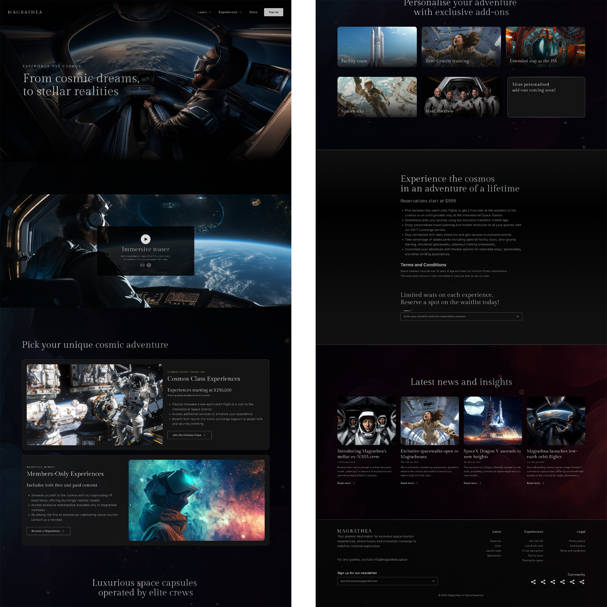
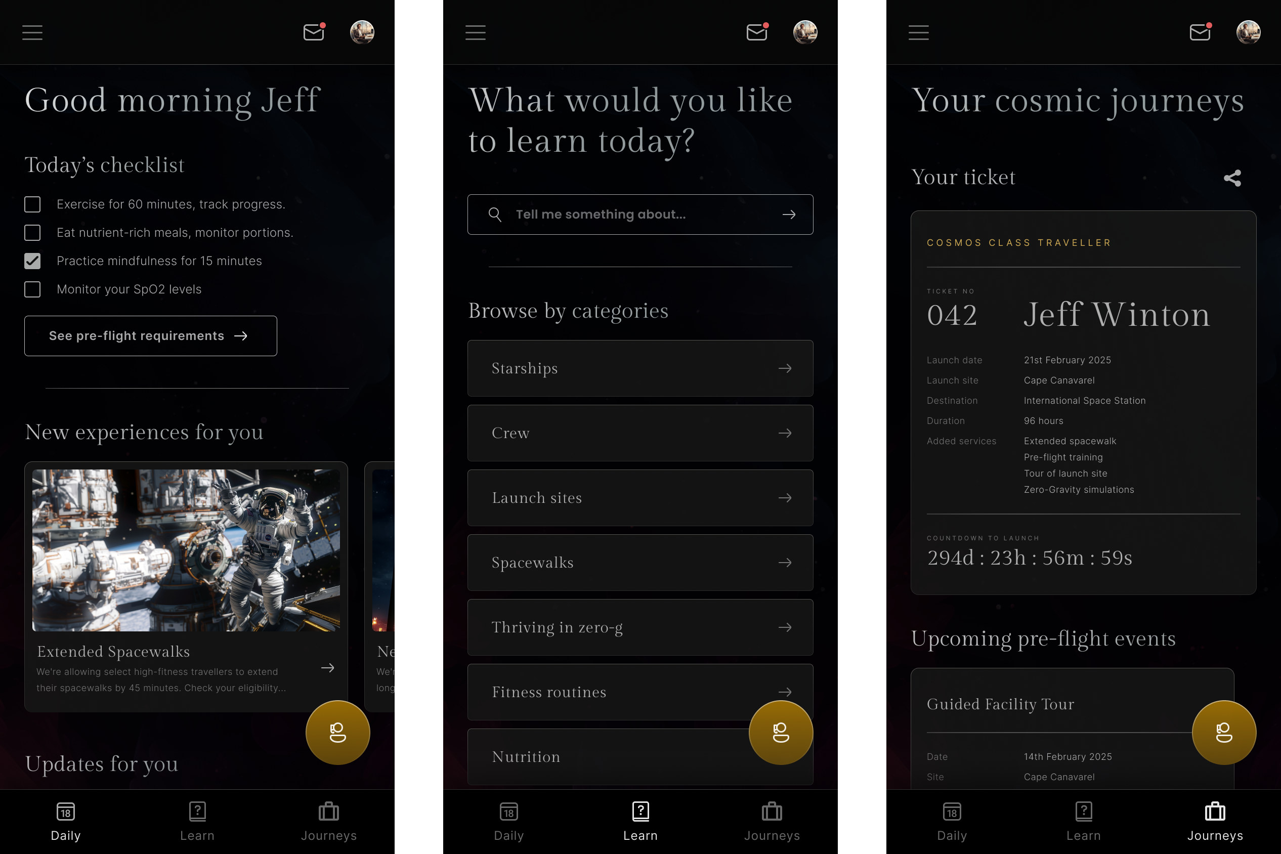
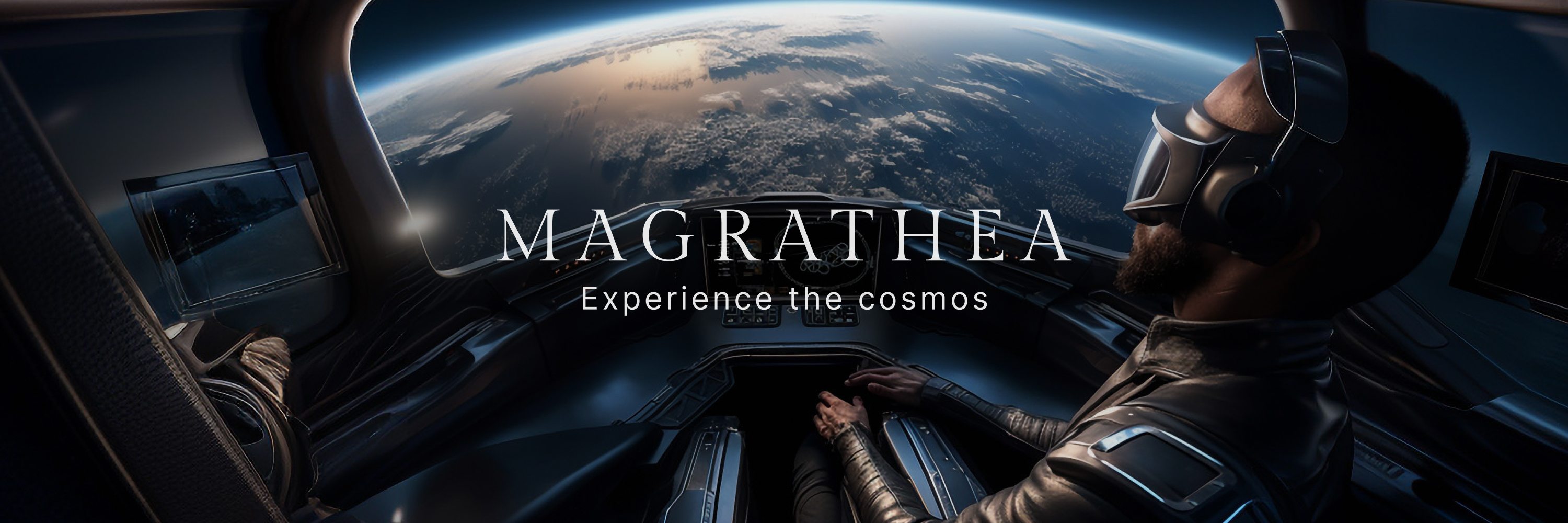
Magrathea began as a design challenge to envision what booking space travel might look like. I conducted basic user research to approach the problem, developed the visual brand, designed several website landing pages, and created a mobile application. I also crafted a presentation to explain my thought process.
Fun fact: The name “Magrathea” is a nod to Douglas Adams’ Hitchhiker’s Guide to the Galaxy, where the Magratheans were luxury planet builders who were commissioned to create the famous the planet-sized computer known as Earth.
Who would buy space-travel tickets?
The main challenge with Magrathea was understanding the persona of someone who could afford space travel and crafting a brand that appealed to their tastes.
Equally important was engaging enthusiasts and potential converts who could champion the idea and serve as ambassadors for Magrathea in their communities.
For high-flyers and dreamers alike
Two primary personas were identified: the ultra-rich, who could afford the tickets outright, and the semi-rich, who might need financial assistance to realise their dreams.
A third persona, enthusiasts, were engaged through virtual reality tours, merchandise, and other content, helping to build Magrathea’s brand image.
Skip the price tags, dive into virtual reality
A key takeaway from this exercise was the realisation that virtual reality can closely mimic real-world experiences, offering luxury to those who may never otherwise experience it.
This project also sharpened my UI design skills and enhanced my use of generative AI to create fitting visuals for such a brand.
Website design samples

Mobile app samples

Research documentation
Website prototype
Best viewed in fullscreen.
Mobile app prototype
Best viewed in fullscreen.
